Data Stories
Graduate level data visualization course (94-870: Telling Stories with Data) enrolled during summer semester (July - August 2019). During the course, I was required to create a compelling narrative with some data provided or to critique existing data visualization materials using a rubric. For each critique, I provide my insights, opinions (positive and negative) and recommndations based on the target audience. In some cases, I recreate the original data visualization.
These exercises helped me develop skills to think critically about my target audience, making visualizations as simple and easy to interpret as possible.
Please visit this page to view my final project.
July 9, 2019: Critique 1
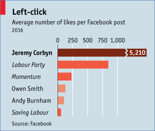
I provided my crtique on the data visualization provided in an Economist article, The metamorphosis - The Labor Party published on August 13, 2016.
Original Visual:

Source: “The Metamorphosis.” The Economist, August 13, 2016. https://www.economist.com/britain/2016/08/13/the-metamorphosis
Critique:
The first thing I notice in this graphic is (1) very long bar not shown completely, (2) different categories shown by different colors and (3) Facebook data was used.
The message I am getting from this chart is that Jeremy Corbyn is very popular. Next I notice that the color of Corbyn's bar is deeper than the rest. I wonder why that is? What's different about it? Is it simply because it is the highest average and is the point of emphasis? Also, what do the different colors mean?
Next I notice that the chart shows a comparison between people and groups. Further the chart compares different types of groups; the article states that Momentum is a movement for Corbyn supporters and I believe the Labour Party is a political party. This seems like comparing apples to oranges to grapefruits. The message may not be lost if only data for Corbyn, Smith and Burnham is shown.
I also notice that there is no mention of Saving Labour in the article provided. I wonder why it's included in this chart. I'm also curious about how long the posts were up for when the count data used to generate this chart was taken. The longer you have a post up for, the more often a posts gets viewed, shared and liked. As far as the title, does the chart artist mean that only data from 2016 was used? Or that the data was taken in 2016? What is left-click?
Finally, are Facebook post likes really indicative of a person's candidacy in a political election. Maybe. Politics appears to be a popularity contest. But are they the best indication? What if Corbyn's facebook posts were cat videos and memes? People like cats for some reason.
What I like:
I kind of liked that the artist didn't bother showing the entire bar for Corbyn. The data for other categories compared may have been significantly overshadowed by Corbyn's popularity. Even though the entire bar wasn't shown, I got a clear idea of what the artist was trying to show - Corbyn's popularity.
What I dislike:
I did not like that Facebook data was used as a crutch for a political polls
What I wish I saw:
(1) I wish I saw polling data, which the article does mention, instead of Facebook likes.
(2) I wish I saw what the colors mean.
(3) I wish I got some context around who Smith & Burnham are. Are they both running against Corbyn in the Labour Party?
Recreated Visual:
I got rid of the data on political parties and movements because that data is irrelevant to the story the author is trying to tell in the article and because the data is comparing the same metric across incompatible categories.
I also got rid of the color because ifferent colors usually represent subgroups within a larger collective group.
I changed the title of the chart because it was not clear what the original title meant.
July 16, 2019: Exercise 1
For this assignment I created infographics for two different perspectives using a recent report from the Department of Homeland Security's Office of Inspector General on dangerous overcrowding and prolonged detention of children and adults at Border Patrol detention centers. You can find the report here.
Perspectives:
(1) As a journalist explaining the report to readers of a newspaper.
Border patrol apprehensions have more than doubled within the last year to nearly a quarter million when compared with the previous period. The largest increase is in the apprehension of children and family units. The Department of Homeland Security reports to be at maximum capacity because of this dramatic increase in detainees, thus leading to overcrowding, prolonged detention and secruity concerns.
The target audience from this perspective are readers who may have political views. I decided to highlight the increase in apprehensions at the border because of the ongoing political debate on immigration. This chart could appeal to audiences on both sides of the aisle. First, those with more conservative political views on immigration may see the increase in apprehensions as an indication of stricter immigration policies and enforcement. On the other hand, readers with more liberal views may view the increase as one more thing to criticize the current administration for.
To maintain a neutral position on this, I used neutral colors.
(2) As an analyst working for the Department of Homeland Security, I am creating data visualizations for high-level policy-makers at DHS as well as other government agencies.
Border patrol apprehensions have more than doubled within the last year to nearly a quarter million when compared with the previous period. The largest increase is in the apprehension of children and family units. The dramatic increase in detainees has led to overcrowding, prolonged detention and secruity concerns.
Source: “Management Alert - DHS Needs to Address Dangerous Overcrowding and Prolonged Detention of Children and Adults in the Rio Grande Valley.” Office of the Inspector General, July 2, 2019. https://www.oig.dhs.gov/sites/default/files/assets/Mga/2019/oig-19-51-jul19.pdf
The second graphic, developed from the perspective of an analyst reporting to high-level policy-makers at DHS and other government agencies, provides insight on matters relating to funding since the audience has the power to make a change, for instance provide additional funding. I used red to highlight the funding deficit and the number of detainees who have been detained longer than is allowed under TED laws.
July 16, 2019: Critique 2
Using Stephen Few's Data Visualization Effectiveness Profile, I provided my crtique on a data visualization of my choosing.
Original Visual:

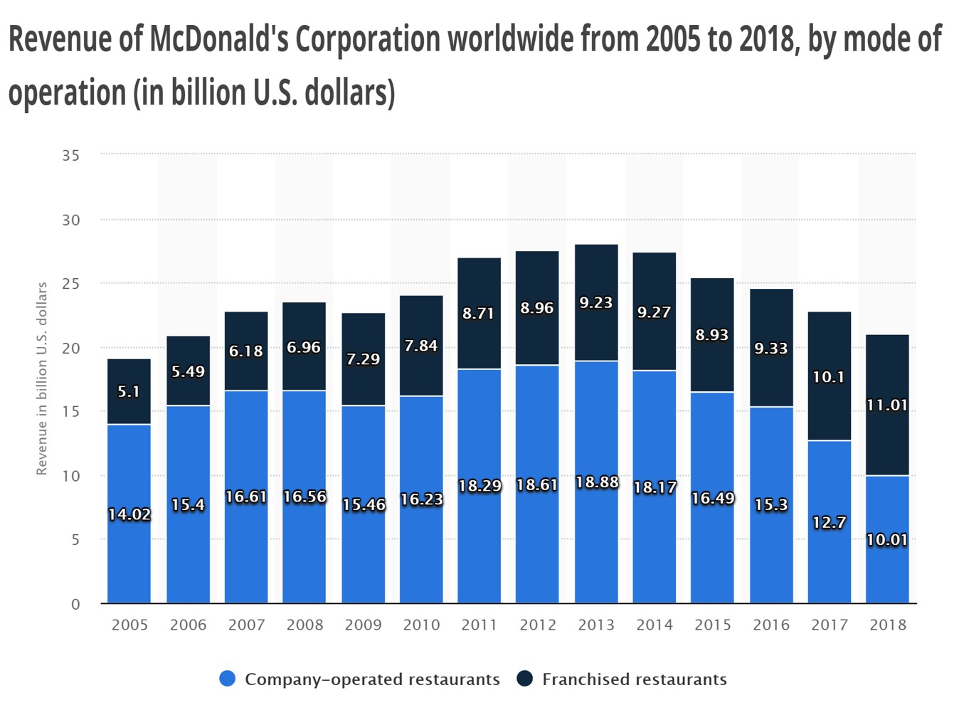
Source: Revenue of McDonald's Corporation worldwide from 2005 to 2018, by mode of operationhttps://www.statista.com/statistics/219447/mcdonalds-revenue-from-company-operated-and-franchised-restaurants/
The original data visualization I selected to critique was quite simple and easy to understand for the most part. In my opinion, the primary audience is people who are interested in finance and business. The use of color does not distract or confuse from the message.
However, I think that the designer missed the opportunity to show to the viewers very quickly that the revenues generated by franchise restaurants at McDonald's had exceeded that of company-owned restaurants by 2018. It is easy to see, from the original graphic, that revenue at company-owned restaurants are declining, but it's not very clear to see the trend in franchise restaurants because of the stacked bars.
I thought this was an important message which is why I have recreated the data visual using trend lines.
Recreated Visual:
July 23 2019: Exercise 2
Source: General Goverment debt-to-GDP ratio (1995 - 2018). OECD Data
For my second visualization, I used an area graph to show the trends in GDP to debt ratio over time.
Source: General Goverment debt-to-GDP ratio (1995 - 2018). OECD Data
I used an area graph to show the OECD data in another chart format. The area graph shows timeseries data, allowing easy comparisons across segments or groups. In this case, the area graph allows the audience easy see the changes in GDP-to-debt ratio over time for each country represented. Countries with higher GDP-to-debt have wider areas, while those with smaller ratios have thinner and narrower areas.